Metro Tasmania App
When you’re catching the bus you need up-to-date information on the go! A great mobile experience is essential when you’re standing at the bus stop trying to work out if you have enough money on your Greencard to get where you are going.
Over the last year we have worked closely with Metro Tasmania to completely rebuild their mobile app from the ground up with a design that is centred on public transport users.
The refreshed Metro Tasmania app has been an immediate hit with average users with over 25,000 people using the app in the first month after launch.


Public transport in your pocket
When we were redesigning the Metro Tasmania app, we thought long and hard about what public transport users want.
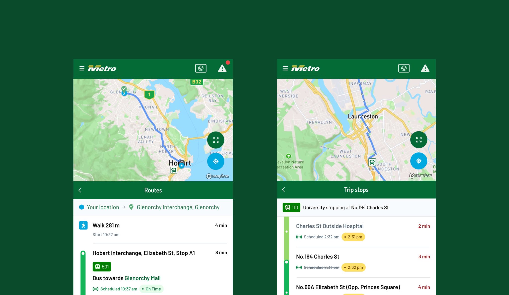
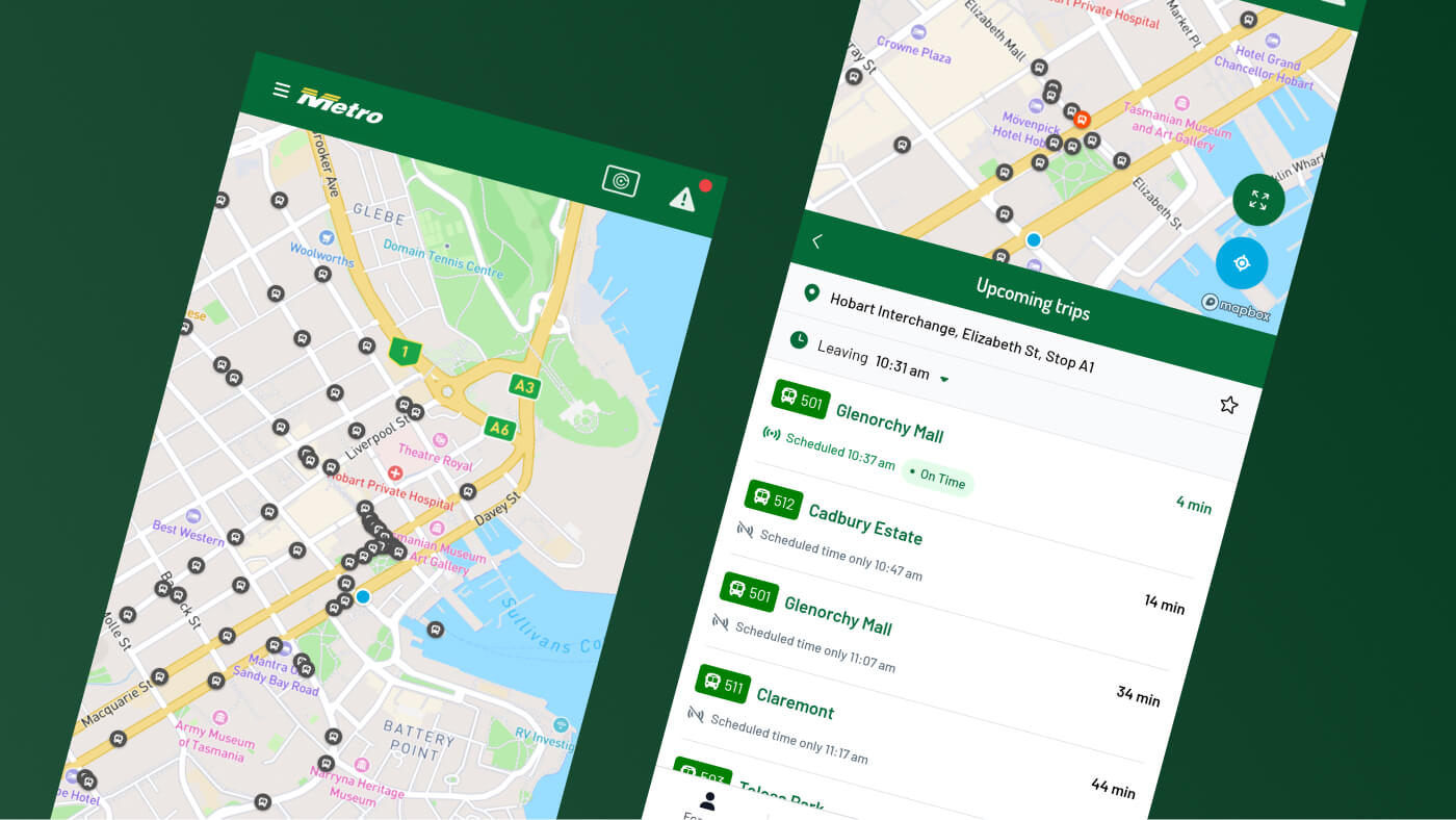
The app already featured a powerful journey planner so users could find the best bus route to school or work and back home again at the end of the day but we wanted to add to this information about your regular bus stops so users can easily see the next services that are passing. The new nearby stops interface allows users to favourite their regular bus stop near their home, school or office and easily view when the next bus is arriving.
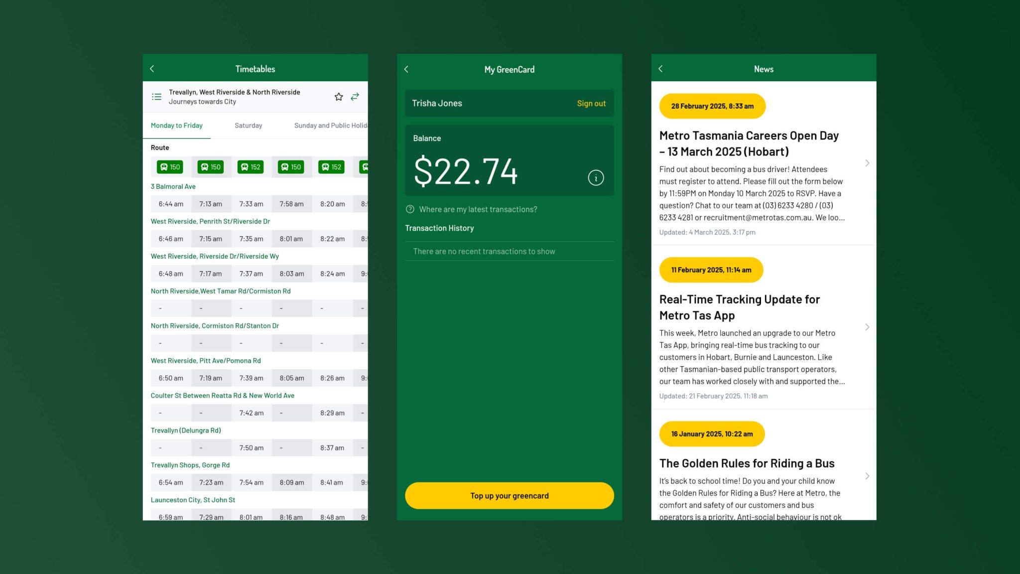
Best of all, we used the new dynamic timetables we built for the Metro Tasmania website to add timetables to the app. Regular public transport users know their local timetable and want to be able to quickly scan to their stop so having this feature on the app is a game changer.
Also, I absolutely LOVE the new Metro App - well done on creating such a user friendly and helpful app.

Real-time network updates
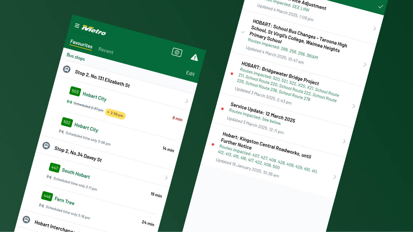
As well as publishing timetables and allowing users to plan their trips, the refreshed Metro Tasmania app also includes real-time alerts when the public transport network is interrupted or delayed.
We designed a single publishing solution for network updates that Metro Tasmania can use to alert users via their website and app when ever an issue arrises.

Your team’s thoughtful design, customer-first thinking and solutions-driven approach helped us deliver a complex project with real and immediate value for Tasmanians. The addition of real-time tracking to the Metro Tas app was no small feat, especially within tight timelines and a complex stakeholder environment, but your team’s clarity and professionalism helped guide the project to success.