26Ten
Adult learners need easy access to support for reading and writing… and here it is.
Creating an easy and clear pathway for people to learn to read and write – and to help people to learn to read and write – was the main goal for the design and execution of the new 26Ten website.
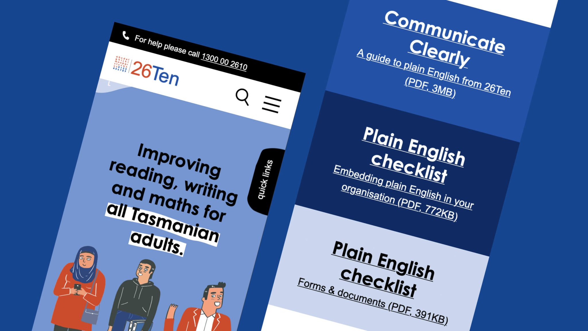
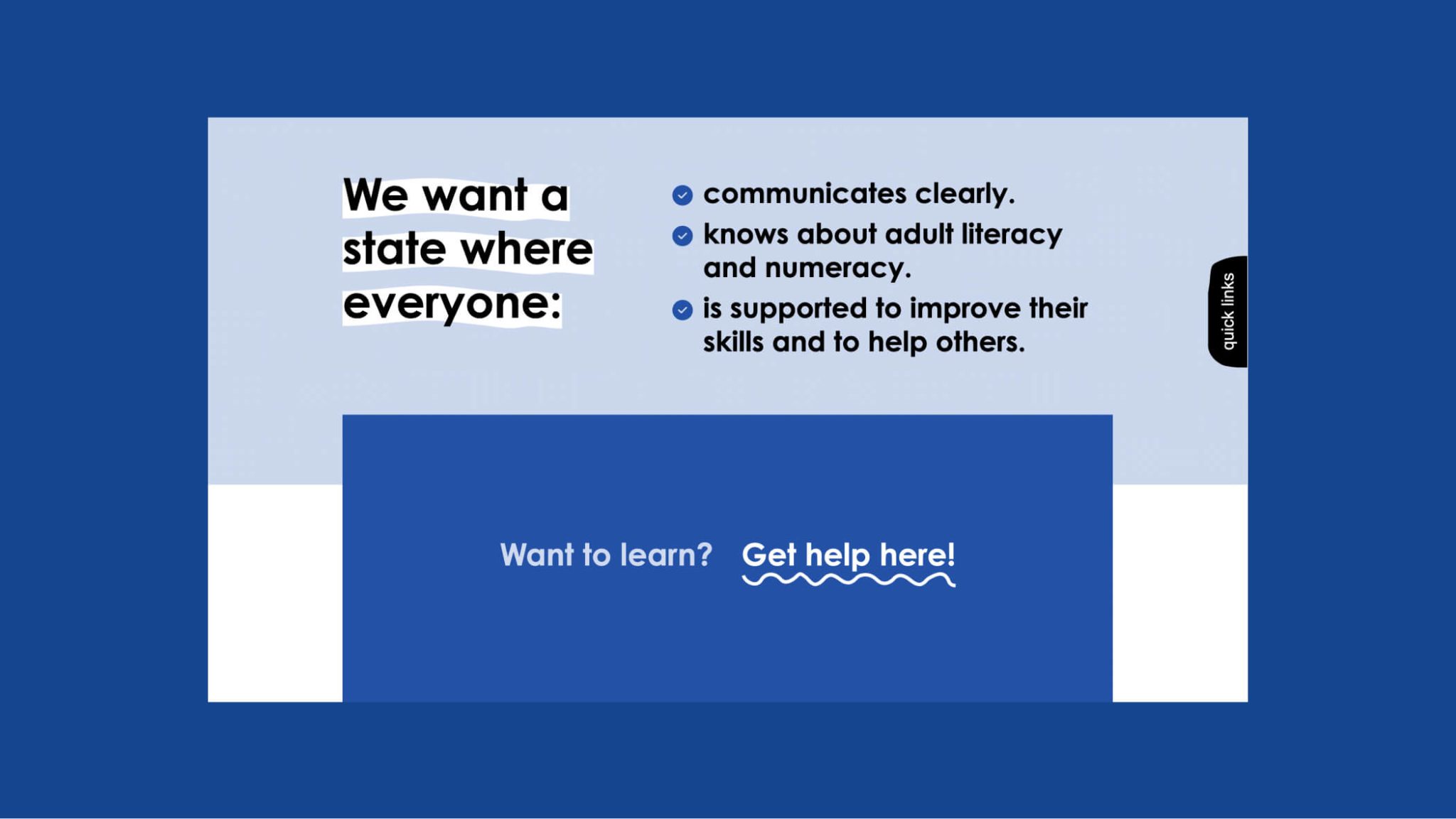
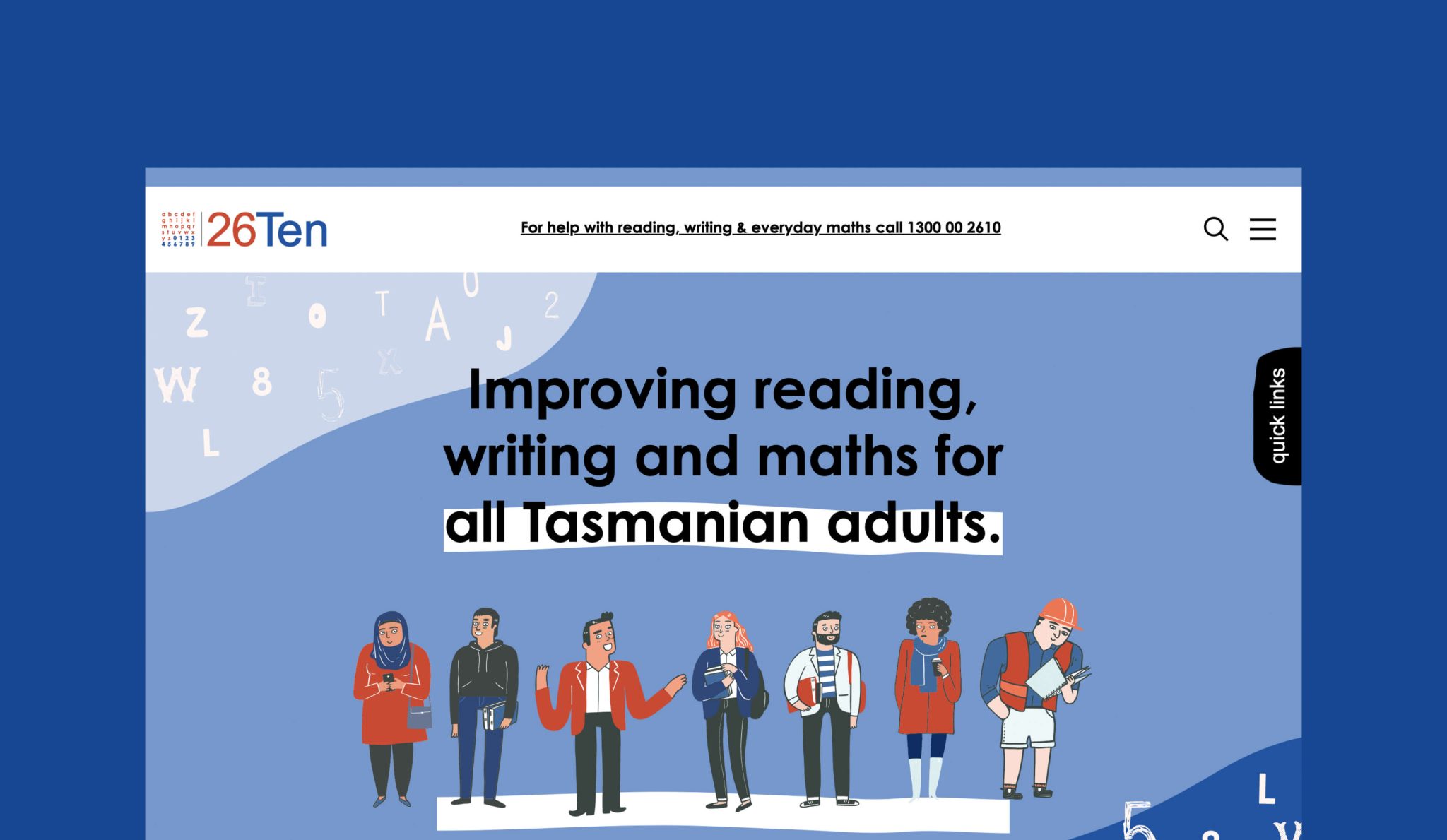
26Ten refreshed the look of their logo, images and colour palette, making it more flexible and easier to use for members of the 26Ten Network and for people who need help. This refresh is part of 26Ten’s constant improvement, recognising the vision for a State where everyone has the literacy and numeracy skills they need for work and life.
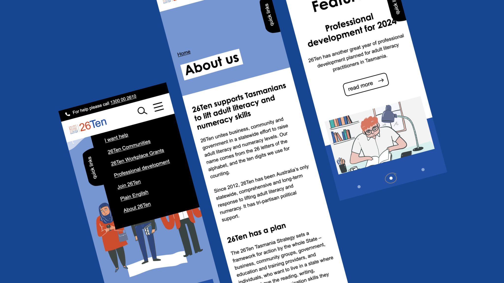
We then stepped in to help 26Ten add this new look to a brand new website – that was not only updated to reflect the new look, but given a complete revamp to make it more accessible and user friendly.
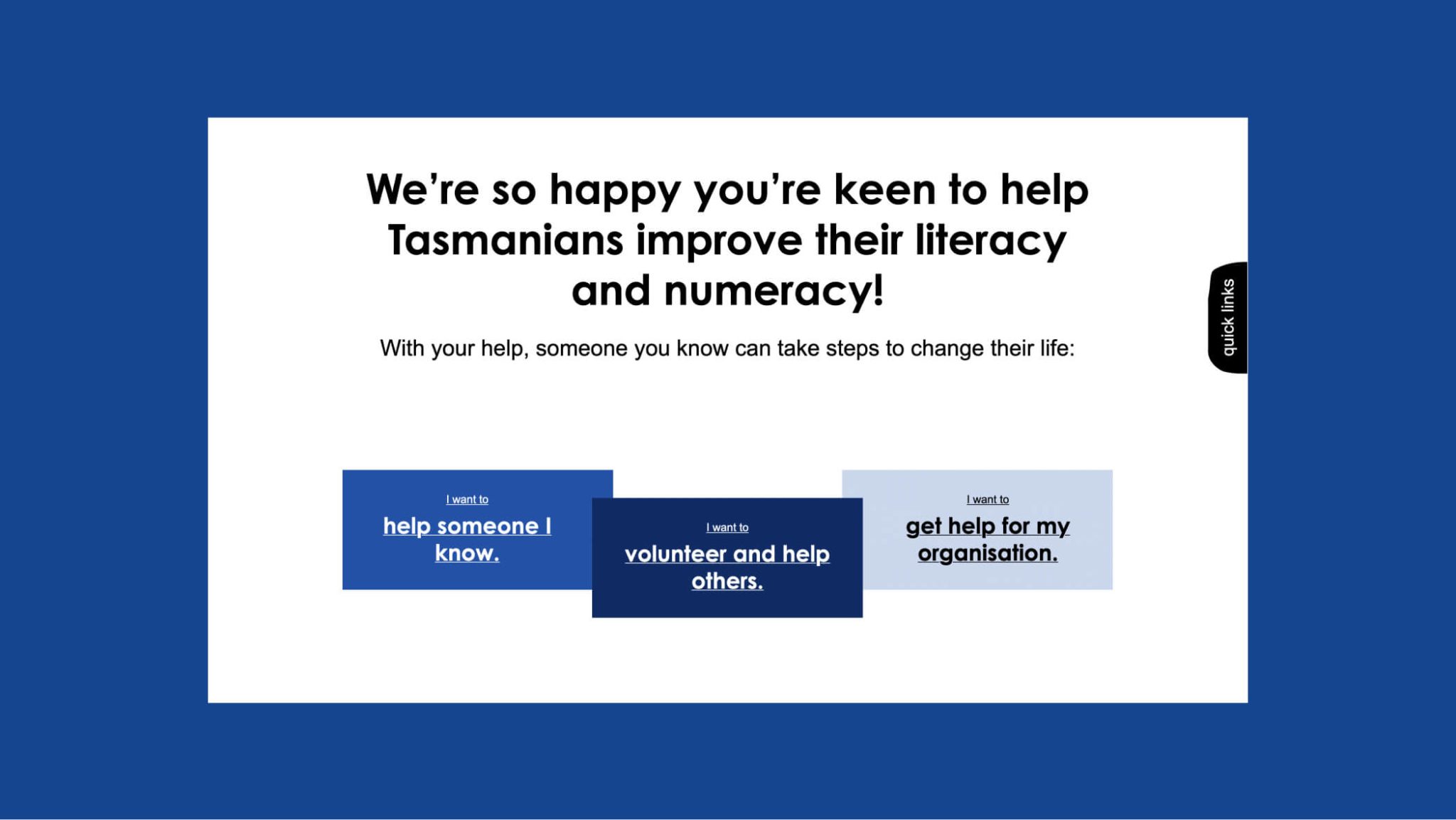
How do we help people discover what 26Ten can help with in an easy and accessible way?
While the brand of 26Ten is well known to many in Tasmania, not everyone is aware that this is the place to visit when you want to learn to read or write, or support adult learners to do so. So how to create a website that has that clarity while not losing site of the many other important activities of 26Ten: such as holding events like 26Ten week or helping organisations, or developing a member network?
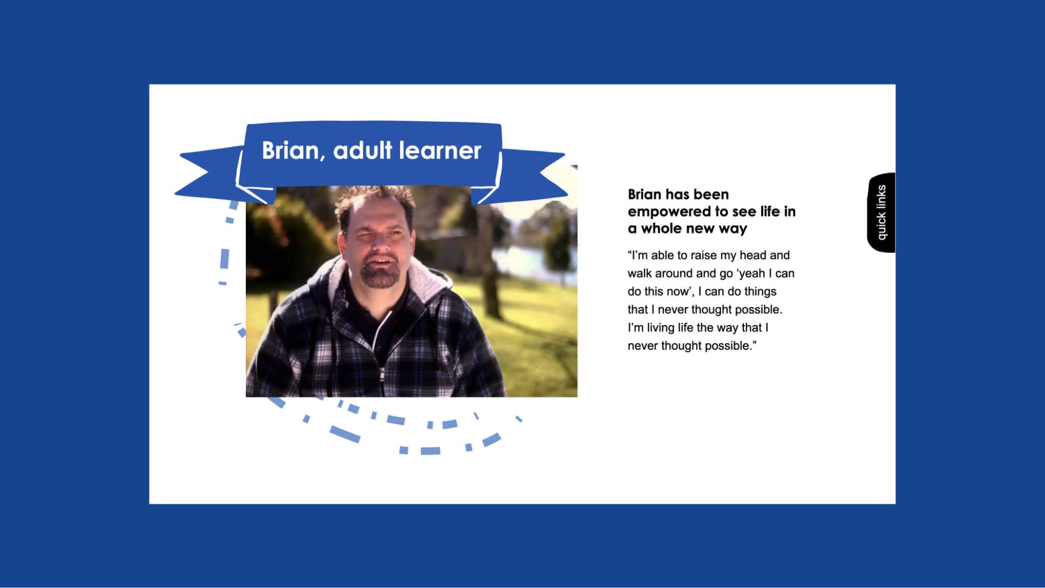
Our approach was to keep it simple at the start, and add different levels of information in a clear and accessible way - while always returning to the key messages of our core goals of wanting to support the Tasmanian community. We made use of video and imagery to further support these messages.
We also worked very closely with 26Ten to ensure that the site was accessible and compliant with WCAG 2.2 Guidelines. We are proud of the efforts made the create a site that worked so well for the people it was designed for.
